Intro
R is a popular language used to analyze data and create graphics based on data. This article describes using R to process IRS data and create related graphics.
Data
We’ll be looking at zipcode-level data for Pennsylvania from 2014. The data is available on the IRS Website.
Although there is a CSV file that contains the data we need, it has headers with special names that need to be decoded. If this were not a one-off project, I’d use the CSV, but there is also an Excel file that contains only Pennslyvania data. I thought it would be a good exercise to try to read and work with the data in this format.
First, we’ll install the packages we’ll need to use throughout this post.
install.packages(
  c("gdata", "geosphere", "rgdal", "maptools", "ggplot2", "plyr"))
library(gdata)
library(geosphere)
library(rgdal)
library(maptools)
library(ggplot2)
library(plyr)
Next, we will download and read the Excel file into our R workspace.
# Create a temporary file path to store the file in
xlspath <- tempfile()
# Download the file to that temporary path
download.file('https://www.irs.gov/pub/irs-soi/14zp39pa.xls', xlspath)
# Read the file into an R dataframe without converting strings to factors,
# and replacing any "** 0" cells with NAs.
irs2014_raw <- read.xls(xlspath, stringsAsFactors = FALSE,
  na.strings = c("** 0"))

irs2014_edited <- irs2014_raw
Here’s what the file looks like if we open it in Excel or LibreOffice.
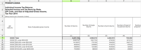
Since the spreadsheet is obviously written for human instead of machine consumption, there are a few things we need to do to normalize the file.
- Create proper column names for the dataframe
- Remove blank entries
- Reformat the data to remove totals, making it a more clean dataset
Rename all the columns from c1 to c129.
irs2014_edited.columncount <- ncol(irs2014_edited)
irs2014_edited.columns_sequence <- 1:irs2014_edited.columncount
names(irs2014_edited) <- paste("c", irs2014_edited.columns_sequence, sep="")
Filter the dataset to just the header row, so that we can get the row number that it starts on. We will assume that the header row is a row which has the text “ZIP\ncode” in the first column. That’s the word “ZIP”, followed by a newline, followed by the word “code”. We can drop all of the rows that occur befor the header.
original_header <- irs2014_edited[grepl("ZIP\ncode", irs2014_edited$c1),]
original_header_row <- as.numeric(rownames(original_header))
row_count <- nrow(irs2014_edited)
omit_original_header_sequence <- original_header_row:row_count
irs2014_edited <- irs2014_edited[omit_original_header_sequence,]
Due to merged cells in the header, there are header cells which are empty. We’ll make the assumption that if a header cell is empty, then that cell’s text should match the cell to its left.
last <- ""
for (col in names(irs2014_edited)) {
  value <- irs2014_edited[1, col]
  if(is.na(value) || value == "") {
    irs2014_edited[1, col] <- last
  }
  else {
    last <- value
  }
}
There is a subheader beneath the primary header. We want to merge the two. We will do that by prefixing all of the subheader cells with the text in the cell right above it. We’ll trim leading and trailing whitespace in the resulting text. Then, we drop the the header row from our data frame.
for(col in names(irs2014_edited)) {
  irs2014_edited[2, col] <- trimws(paste(
    irs2014_edited[1, col], irs2014_edited[2, col]))
}

irs2014_edited <- irs2014_edited[-1,]
The spreadsheet has internal column numbers that we want to remove underneath the original subheader.
internal_cols_row <- which(irs2014_edited == "(-1)", arr.ind = TRUE)[1]
irs2014_edited <- irs2014_edited[-internal_cols_row,]
And we need to remove aggregate and blank rows inside ths spreadsheet so that our sums will be accurate, by filtering to rows which DO NOT contain these values. We make the assumption that these rows will have the word “Total” or an empty string in the second column.
values_to_remove <- c("Total", "")
irs2014_edited <- irs2014_edited[!(irs2014_edited$c2 %in% values_to_remove),]
Next, we want the data frame column names to match what we currently have in the first, header row. We can drop the header row afterwards.
names(irs2014_edited) <- gsub("[\r\n]", " ", irs2014_edited[1,])
irs2014_edited <- irs2014_edited[-1,]
Those are the major changes necessary to begin working with the data.
Working with the data
It seems as if all the columns after the second column are numeric, so we can convert them all so that calculations will work like we expect.
for (col in 3:ncol(irs2014_edited)) {
  irs2014_edited[,col] <- as.numeric(as.character(irs2014_edited[,col]))
}
To make our code easier to work with, we will create a new data frame containing just the data we need, with simple names.
irs2014 <- data.frame(
  incomeFactor = as.factor(irs2014_edited$`Size of adjusted gross income`),
  returns = irs2014_edited$`Number of returns`,
  income  = irs2014_edited$`Total income Amount`,
  zip = irs2014_edited$`ZIP code [1]`
)
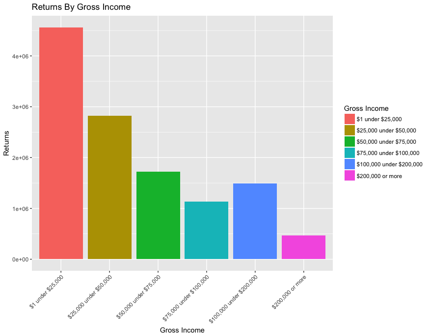
What percentage of returns is each Gross Income class?
We can answer this by summing the returns by the incomeFactor column.
returns_by_incomeFactor <- aggregate(returns ~ incomeFactor, data=irs2014, sum)
             incomeFactor returns
1        $1 under $25,000 4562430
2 $100,000 under $200,000 1487590
3        $200,000 or more  469030
4   $25,000 under $50,000 2822410
5   $50,000 under $75,000 1719250
6  $75,000 under $100,000 1137580
We can see the ordering is a bit awkward, so let’s reorder this.
returns_by_incomeFactor$min_value <- c(1, 100000, 200000, 25000, 50000, 75000)
returns_by_incomeFactor <- returns_by_incomeFactor[
  order(returns_by_incomeFactor$min_value), ]

# but we also need to specify the order of the factor's levels
returns_by_incomeFactor$incomeFactor <- factor(
  returns_by_incomeFactor$incomeFactor,
  levels=unique(returns_by_incomeFactor$incomeFactor))
             incomeFactor returns min_value
1        $1 under $25,000 4562430         1
4   $25,000 under $50,000 2822410     25000
5   $50,000 under $75,000 1719250     50000
6  $75,000 under $100,000 1137580     75000
2 $100,000 under $200,000 1487590    100000
3        $200,000 or more  469030    200000
That’s better. Let’s try to visualize this with a simple bar graph.
bar <- ggplot(returns_by_incomeFactor,
    aes(incomeFactor, weight=returns, fill=incomeFactor)) +
  geom_bar() +
  theme(axis.text.x = element_text(angle = 45, hjust=1)) +
  ggtitle("Returns By Gross Income") +
  ylab("Returns") +
  labs(fill = "Gross Income") +
  xlab("Gross Income")
plot(bar)
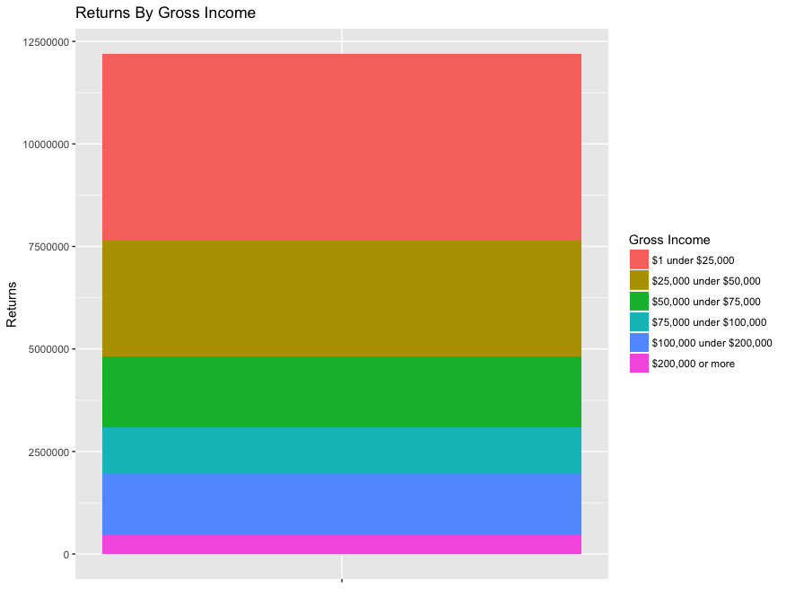
bar_single <-
  ggplot(returns_by_incomeFactor,
    aes(x="", y=returns, fill=incomeFactor)) +
  geom_bar(stat="identity") +
  ggtitle("Returns By Gross Income") +
  ylab("Returns") +
  labs(fill = "Gross Income") +
  xlab("")

plot(bar_single)
The total number of returns is easier to see if we use a stacked bar.
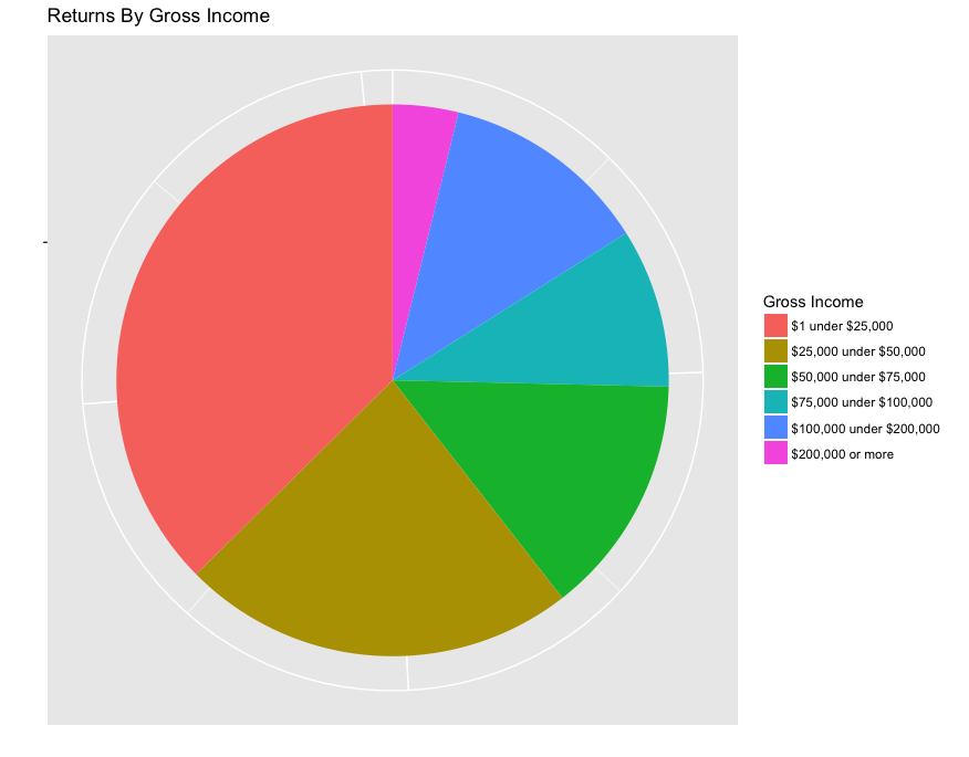
Here’s a pie chart, if that’s your thing, although they look terrible in ggplot.
pie <-
  ggplot(returns_by_incomeFactor,
    aes(x="", y=returns, fill=incomeFactor)) +
  geom_bar(width=1, stat="identity") +
  ggtitle("Returns By Gross Income") +
  ylab("") +
  xlab("") +
  labs(fill = "Gross Income") +
  coord_polar("y") +
  theme(axis.text.x=element_blank())
plot(pie)
What are the areas with the highest gross income?
We can visualize the data geospatially by using some of ggplot2’s map visualizations. The concept is that we have arbitrary regions whose shape is defined by a list of points (longitude and latitude). These regions have ids which we will map to ids in our data.
Although there are certain shapes included with ggplot2, including state and
county shapes, there are no shapes by zipcode. There are some existing R
packages that provide zipcode shapes, but we will retrieve them from the source.
Pennsylvania Spatial Data Access
is one such source of shape data. We can download a zip file from this location,
and unzip it somewhere.
# Create a couple temporary paths
shapefile_path <- tempfile()
output_path <- tempfile()

# Download the file from the FTP server
download.file(
  'ftp://ftp.pasda.psu.edu/pub/pasda/census/tl_Pennsylvania5Digit2009.zip',
  shapefile_path)

# Unzip the archive containing the shapefiles
unzip(shapefile_path, exdir = output_path)

# Load the shapefile
pazips_shapes_raw <- readOGR(dsn=output_path, layer="tl_Pennsylvania5Digit2009")
We need to preprocess the data to use it for maps. We will use fortify to
create a dataframe from the shapefile model. pazips_points contains the
points for each zipcode shape.
pazips_points = fortify(pazips_shapes_raw)
       long      lat order  hole piece id group
1 -80.01641 40.35900     1 FALSE     1  0   0.1
2 -80.01634 40.35940     2 FALSE     1  0   0.1
3 -80.01629 40.35954     3 FALSE     1  0   0.1
4 -80.01621 40.35968     4 FALSE     1  0   0.1
5 -80.01609 40.35983     5 FALSE     1  0   0.1
6 -80.01594 40.35995     6 FALSE     1  0   0.1
We also do some processing on the data with respect to each shape (zipcode).
pazips_data contains shape/zipcode-level data. pazips_data$id corresponds
to the pazips_points$id
pazips_data <- pazips_shapes_raw@data
pazips_data$id <- rownames(pazips_data)
  ZCTA5CE CLASSFP MTFCC FUNCSTAT     ALAND AWATER    INTPTLAT     INTPTLON id
0   15236      B5 G6350        S  26601853      0 +40.3437143 -079.9777046  0
1   15213      B5 G6350        S   5954744   8799 +40.4431746 -079.9554052  1
2   15136      B5 G6350        S  24770071      0 +40.4680072 -080.1010063  2
3   15202      B5 G6350        S  11605997      0 +40.5066279 -080.0695996  3
4   15082      B5 G6350        S    606828      0 +40.3751608 -080.2151494  4
5   15057      B5 G6350        S 137051089 211171 +40.3587623 -080.2437771  5
Because we want to avoid mapping all of the zipcodes in PA, we will limit the
map to an area surrounding Willow Grove Mall. Each zipcode has a centroid
defined by columns INTPTLAT and INTPTLON. We will add a column giving the
number of meters that centroid is from Willow Grove Mall.
willow_grove_mall_coords <- c(-75.1257827,40.1401633)

# Convert the centroid coordinate to numeric for calculation
pazips_data$clong <- as.numeric(as.character(pazips_data$INTPTLON))
pazips_data$clat <- as.numeric(as.character(pazips_data$INTPTLAT))

# Gives the distance in meters
pazips_data$distance_from_wg <- distm(
  pazips_data[,c("clong", "clat")], willow_grove_mall_coords, fun=distCosine)
And filter results to include only zipcodes that are nearby.
# Filter results to zipcodes up to 15 miles away
meters_in_mile <- 1610
distance_away <- meters_in_mile * 12
pazips_nearby <- pazips_data[pazips_data$distance_from_wg < distance_away,]

# Filter to only those zipcodes used above
pazips_points_nearby <- pazips_points[pazips_points$id %in% pazips_nearby$id,]
Next, we will sum gross income by zipcode. We will also make sure that centroids are included.
by_zip_raw <- aggregate(cbind(income, returns) ~ zip, data=irs2014, sum)
by_zip_raw <- by_zip_raw[!(by_zip_raw$zip %in% c("00000", "99999")), ]
pazips_data$zip <- pazips_data$ZCTA5CE
by_zip_with_centroids <- join(by_zip_raw, pazips_data, by="zip")

# We reformat the dataframe above into a new dataframe containing only the
# fields we need because extra fields can cause issues with ggplot in that
# ggplot makes certain assumptions about field names.
by_zip <- data.frame(
  id = by_zip_with_centroids$id,
  income = by_zip_with_centroids$income,
  returns = by_zip_with_centroids$returns,
  zip = by_zip_with_centroids$zip,
  clong = by_zip_with_centroids$clong,
  clat = by_zip_with_centroids$clat
)
by_zip <- by_zip[by_zip$id %in% pazips_nearby$id,]
       id income   zip     clong     clat
1139   43 986997 18914 -75.20939 40.29260
1140  358  49222 18915 -75.25679 40.27258
1144  877 413211 18925 -75.06159 40.28338
1145  448 550635 18929 -75.07849 40.25429
1148 1449  14045 18936 -75.22923 40.22598
1155  659 584713 18954 -74.99296 40.22541
Finally we create the map:
# We reformat the dataframe pazips_points to have the keys the ggplot expects
# in map dataframes.
map_points <- data.frame(
id = pazips_points_nearby$id,
x = pazips_points_nearby$long,
y = pazips_points_nearby$lat
)
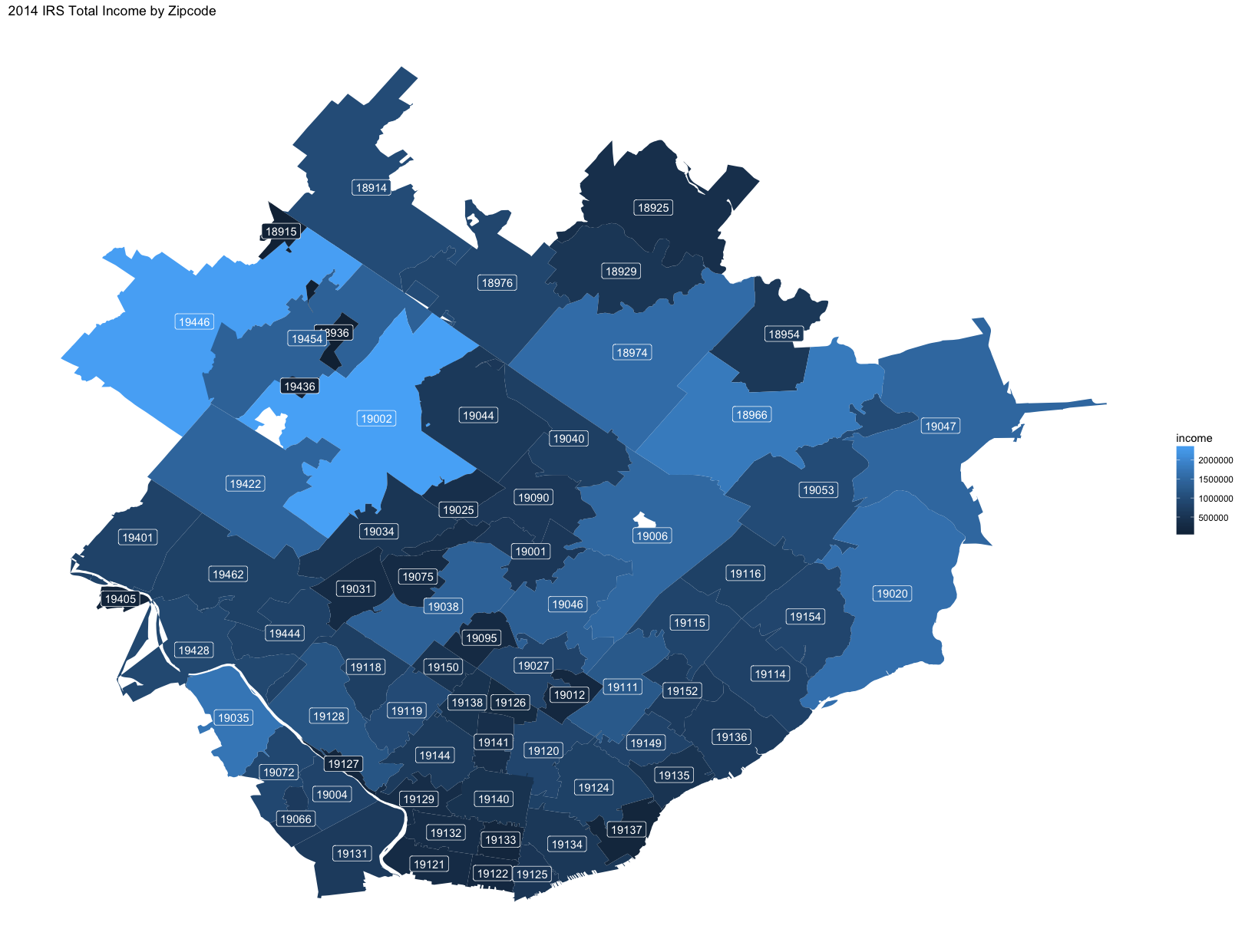
ggplot(by_zip, aes(fill=income)) +
geom_map(aes(map_id = id), map=map_points) +
# geom_label adds a background color to the text, making it easier to read.
geom_label(aes(label=zip, x=clong, y=clat), color="white") +
expand_limits(map_points) +
theme_classic() +
theme(
axis.line = element_blank(),
axis.title = element_blank(),
axis.text = element_blank(),
axis.ticks = element_blank()) +
ggtitle("2014 IRS Total Income by Zipcode")
Although this shows the sum of the gross income in each zipcode, we also want to see the number of returns because the gross income could be far outbalanced by fewer larger gross incomes. We also change the color so that it looks a bit different.
ggplot(by_zip, aes(fill=returns)) +
  geom_map(aes(map_id = id), map=map_points) +
  # geom_label adds a background color to the text, making it easier to read.
  geom_label(aes(label=zip, x=clong, y=clat), color="white") +
  expand_limits(map_points) +
  scale_fill_gradient(low="palegreen", high="forestgreen") +
  theme_classic() +
  theme(
    axis.line = element_blank(),
    axis.title = element_blank(),
    axis.text = element_blank(),
    axis.ticks = element_blank()) +
  ggtitle("2014 IRS Returns by Zipcode")
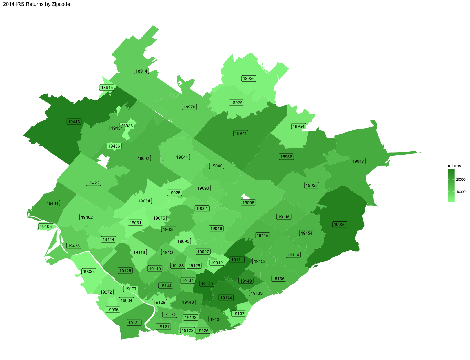
We can see some possible insights here. Zipcode 19035 (Gladwyne), at the bottom left, has a total income on the high end, but has few returns. This indicates that this area is more affluent than the other members of this cohort. Zipcode 19120 (Olney), at the bottom middle, has a high number of returns but a total income on the lower end, indicating it is a poorer area than the other locations in these maps.
Deeper Analysis
These maps are a nice looking visualization, but are probably better as part of a report, once you have a story to tell. Some other useful graphs…
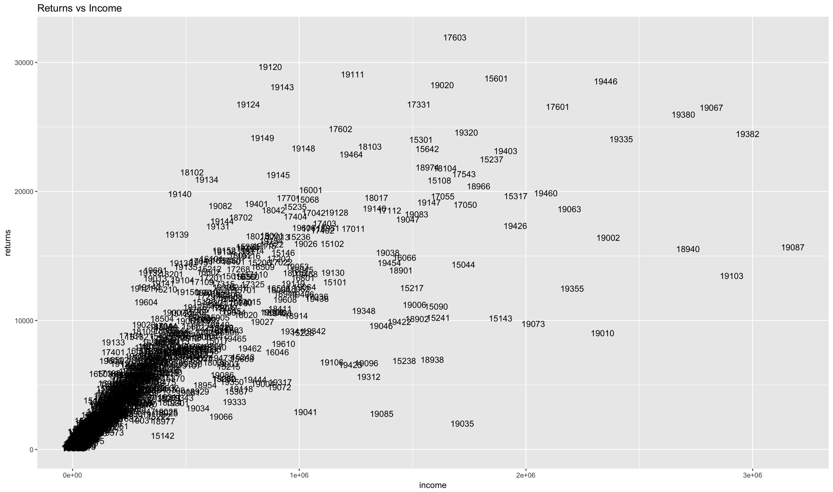
We can compare the returns and income for each zipcode using a scatterplot.
# remove the row with zipcode not weird
by_zip_all <- by_zip_raw[!(by_zip_raw$zip %in% c("00000", "99999")), ]
# render a scatterplot
scatterplot <- ggplot(by_zip_all, aes(x=income, y=returns)) +
  geom_point() +
  ggtitle("Returns vs Income")
plot(scatterplot)
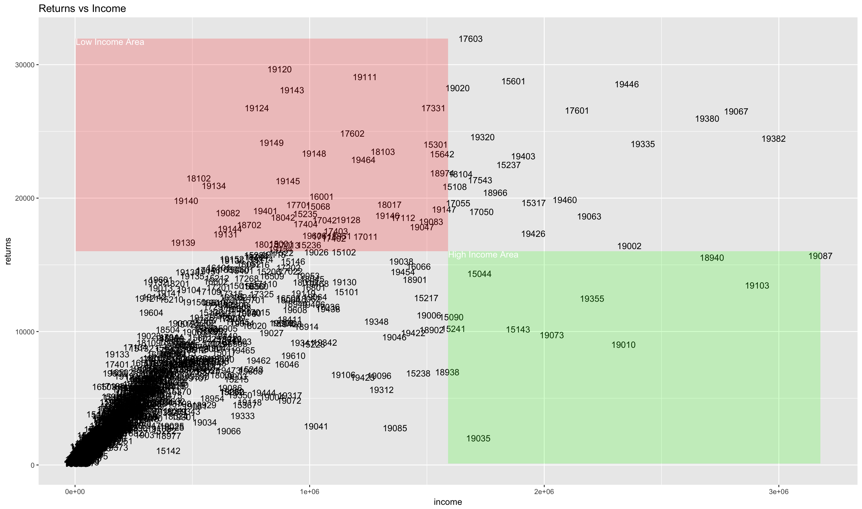
We can make things more clear by adding annotations to the graph which makes areas of interest clearer.
income_range <- range(by_zip_all$income)
income_mid <- sum(income_range)/2

returns_range <- range(by_zip_all$returns)
returns_mid <- sum(returns_range)/2

low_income_area <- data.frame(x = income_range[1], y = returns_mid)
low_income_area[nrow(low_income_area) + 1,] =
  list(income_mid, returns_mid)
low_income_area[nrow(low_income_area) + 1,] =
  list(income_mid, returns_range[2])
low_income_area[nrow(low_income_area) + 1,] =
  list(income_range[1], returns_range[2])
low_income_area$id <- rownames(low_income_area)

ggplot(by_zip_all, aes(x=income, y=returns)) +
  ggtitle("Returns vs Income") +
  geom_text(aes(label=zip)) +
  annotate("rect",
    xmin=income_range[1], xmax=income_mid,
    ymin=returns_mid, ymax=returns_range[2],
    alpha = .2, fill="red") +
  annotate("text",
    x=income_range[1], y=returns_range[2], hjust=0, vjust=1,
    label="Low Income Area", color="white") +
  annotate("rect",
    xmin=income_mid, xmax=income_range[2],
    ymin=returns_range[1], ymax=returns_mid,
    alpha = .2, fill="green") +
  annotate("text",
    x=income_mid, y=returns_mid, hjust=0, vjust=1,
    label="High Income Area", color="white")
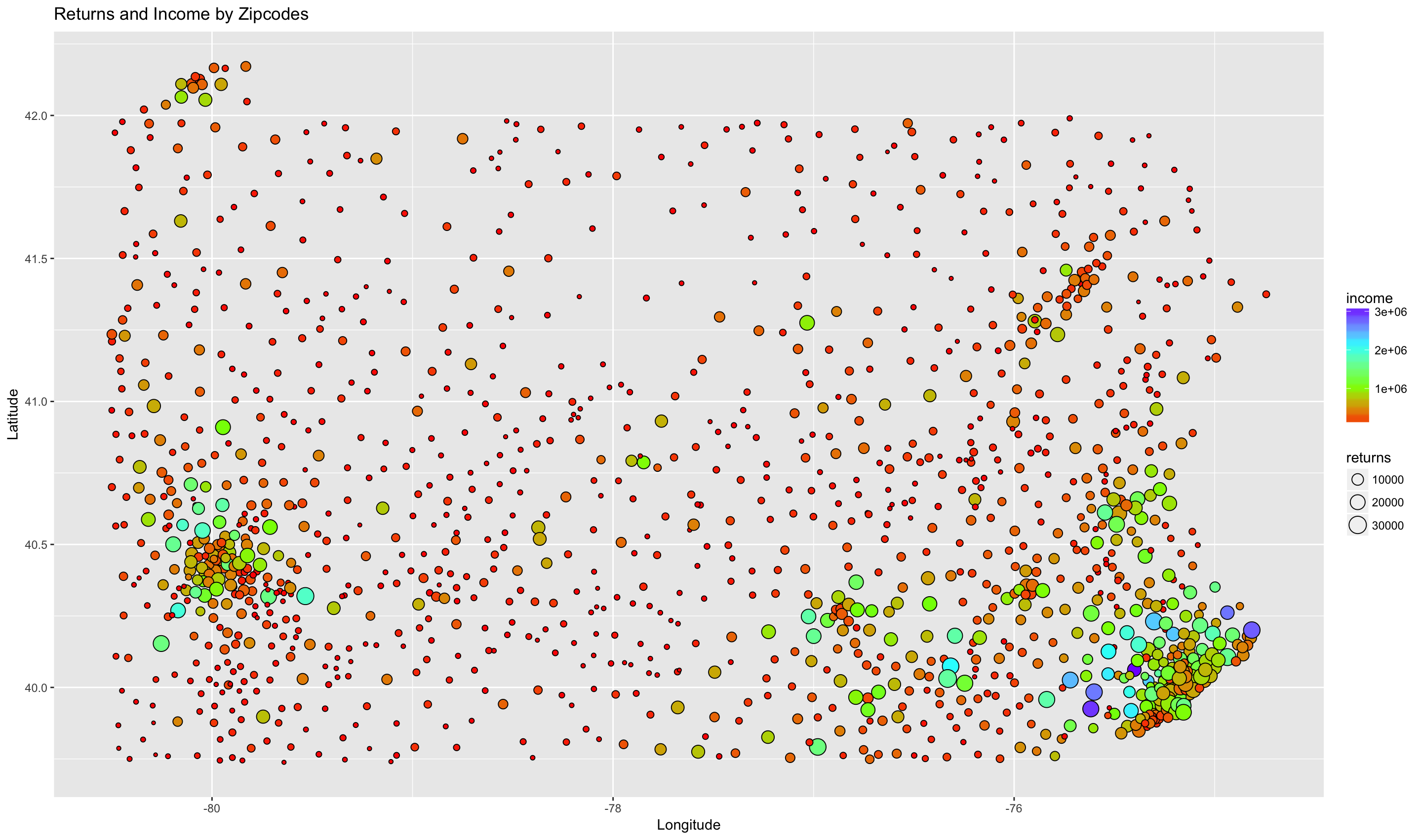
One of the problems with this is that all of the zipcode information overlaps in this type of scatterplot. We can use a weighted scatterplot to convey the same information, and, at the same time, convey the geospatial relationship of the zipcodes. We will use size to indicate the number of returns, fill to indicate the total income, and x and y coordinates for latitude and longitude of each zipcode’s centroid. This is really a combination of the two maps above, with the zipcodes removed. There are solutions for displaying the zipcodes in a readable way that we won’t go into. 1, 2
by_zip_with_centroids <- by_zip_with_centroids[!(by_zip_with_centroids$zip %in% c("00000", "99999")), ]
ggplot(by_zip_with_centroids, aes(x=clong, y=clat, size=returns, fill=income)) +
  geom_point(shape=21) +
  scale_fill_gradientn(colors=rainbow(4)) +
  ggtitle("Returns and Income by Zipcodes") +
  xlab("Longitude") + ylab("Latitude")
Working with Categorical data
Recall that there is a categorical column in the data which creates groups by gross income. We can use that factor to produce some other graphs.
Let’s compare the bottom and top 30 zip codes in terms of total income. We’ll create a stacked bar chart showing these zip codes and how the gross income classes make up the total income.
by_zip_income_asc <- by_zip_raw[order(by_zip_raw$income),]
by_zip_income_desc <- by_zip_raw[order(-by_zip_raw$income),]

target_zips <- c(
  as.character(head(by_zip_income_asc$zip, 30)),
  as.character(head(by_zip_income_desc$zip, 30)))

by_zip_excerpt <- irs2014[irs2014$zip %in% target_zips,]
by_zip_excerpt$incomeFactor <- factor(
  by_zip_excerpt$incomeFactor,
  levels=unique(by_zip_excerpt$incomeFactor))

# Change the levels for the zip column to order by income
by_zip_excerpt$zip <- factor(by_zip_excerpt$zip, levels = target_zips)
ggplot(by_zip_excerpt,
  aes(x = zip, weight = income, fill=incomeFactor)) +
  geom_bar() +
  theme(axis.text.x = element_text(angle=45, hjust=1)) +
  scale_y_continuous(trans = "log10")
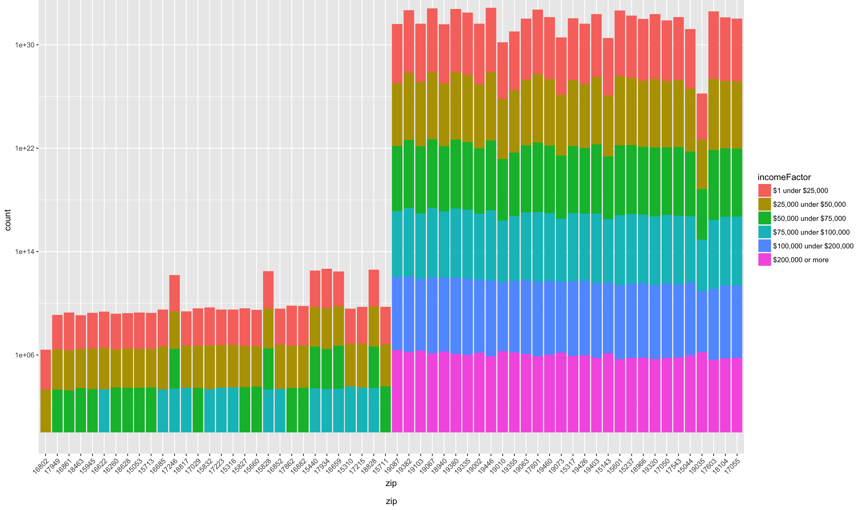
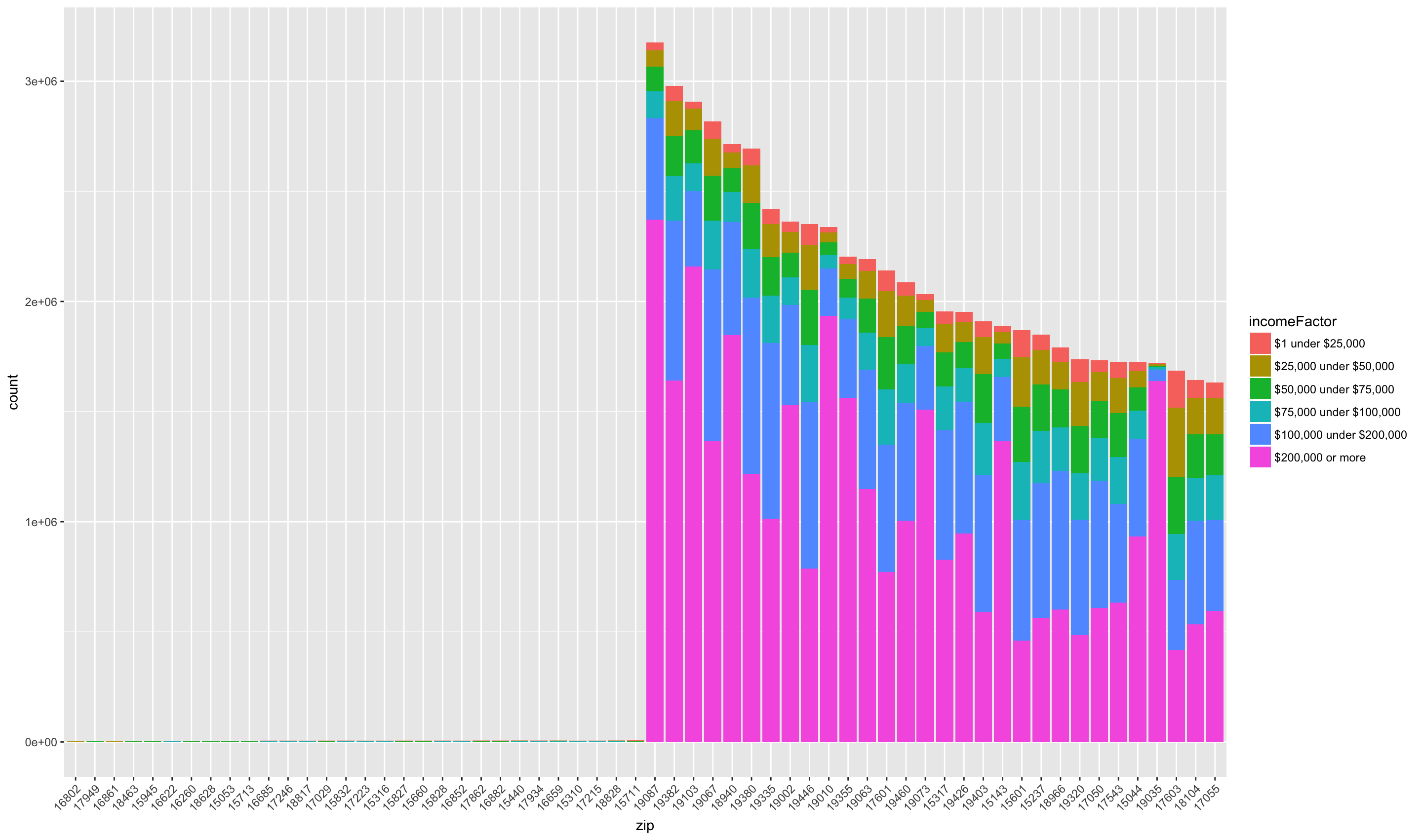
We can see that the bottom zip codes are missing gross income classes “$100,000 under $200,000” and “$200,000 or more”. Note zip code 16802, State College, which is made up mostly of the lowest two gross income categories. Another notable area is Gladwyne (19035). We can see that the size of largest income class, “$200,000 or more” is among the largest across all zip codes, and that each other class is smaller than the other zip codes. We can make this relationship clearer if we use a regular, instead of logarithmic scale, for the y axis.
We can focus on the gross income class “$200,000” to find more affluent areas.
high_income <- irs2014[irs2014$incomeFactor == "$200,000 or more",]
high_income <- high_income[order(-high_income$income),]
high_income <- high_income[high_income$income > 0,]
rownames(high_income) <- NULL
high_income$order <- rownames(high_income)
high_income_excerpt <- head(high_income, 50)
high_income_excerpt$zip <- factor(
  high_income_excerpt$zip, levels=high_income_excerpt$zip)
ggplot(high_income_excerpt,
  aes(x = zip, weight=income)) +
  geom_bar() +
  theme(axis.text.x = element_text(angle=45, hjust=1))
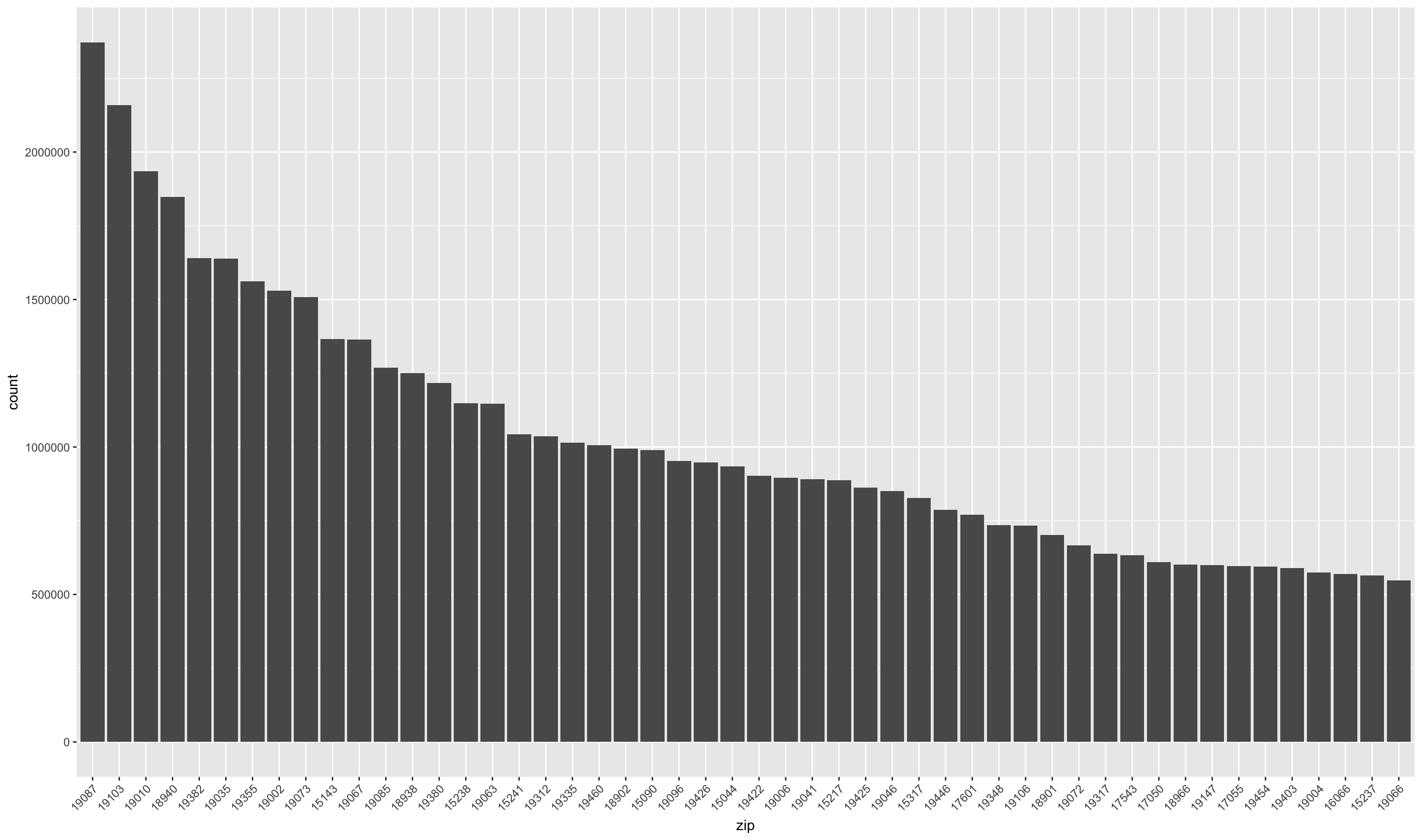
We can see that the largest total income areas are Wayne (19807), Rittenhouse Square (19103), and Bryn Mawr (19010).
Conclusion
In this post, we cleaned up IRS Tax Return data in an Excel Spreadsheet. We
aggregated results on various dimensions, and evaluated the results using
different ggplot2 visualizations. ggplot2 is a rich visualization library
for r that has great possibilities for customization.