Intro
See the previous part of the guide. In this installment, I’ll discuss some methods of producing art for the book, reveal my first draft WIP, and discuss the refinement step.
Process
Pick a moralPick a themeLayout the storyStoryboard the scenesFlesh out the storyRefine- Further Refinement
Producing Art
Before I discuss refinement, I’d like to digress from the main point of these articles to briefly touch upon the topic of art.
You don’t need to be a skilled illustrator to create one of these story books (I’m definitely not). There are alternatives to drawing the scenes, including sourcing clipart and photos online (although there are copyright you will want to investigate if creating something for commercial purposes). You could also take photos yourself, arranging scenes using dolls, action figures, and/or building blocks.
If you do decide to draw the scenes, you have the choice of whether to use a traditional or digital medium.
If you are not proficient with digital tools, you may want to scan art you’ve hand drawn. If you have some sort of tablet or touch device, you might want to try a painted/pen art-style. For example there are many free (and cheap) iOS applications such as Brushes 3, Sketchbook Express and Paper, which may be used to create your drawings without a lot of digital media experience.
If however you are experienced with digital media tools, you may want to take extra consideration for your art style. Will you use your art for another purpose? Will you want to reuse art? How important is time versus style? For example, you could create your vector art in a way that minimizes the total amount of content you need to create.
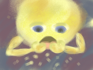
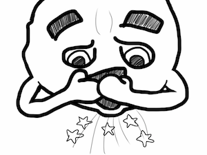
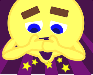
Here’s a comparison of a couple different styles of the same scene:


First WIP
As I created sketches and began to flesh out the artwork, I had to make decisions affecting the consistency of the characters appearance and some of the details of the art style. You’ll notice that the drawings are inconsistent in several places, and we’ll discuss this more during refinement. If we were experienced at doing this, we might be able to work with fewer drafts, but I think the greatest way to get better something is by practicing with incremental approvements.
To get a better sense of the captions for each picture, I used Google Presentation in Google Drive. You could use any presentation software for a similar purpose, such as Keynote or Microsoft PowerPoint.
Further Refinement
Even though the storybook is starting to come together, there are a number of problems. As mentioned above, the style of the drawings differs based on the order in which they were drawn (see if you can figure out in what order they were created).
Another problem is that the text is a bit disconnected. This can be solved easily by adding more scenes between the ones that feel disconnected, but obviously requires more work.
There are shortcuts taken with certain scenes. For example, on the page where Moony is working with a puzzle, the tamborine and blocks have gradient effects that don’t mesh with the flat color of the other pages. This is because these elements were sourced from Open ClipArt.
The backgrounds are either a mess or brilliant. Some are dark (like space might be), some are bright (for no good reason), and all are just geometric patterns. I had a tough time thinking of what should be in the background!
Finally, Moony is not easily recognizable as the moon. Okay, so that is not such a huge problem since the text helps out, but it’s worth considering.
Conclusion
I’ll continue to work on this, and you can find my most recent work product on Github. There are two important things that I think are useful to take away from this series of articles.
First, that we can use a simple, straightforward, and procedural framework to produce something creative. Second, that rather than relying on great, masterful sweeps of innovation, we can methodically work towards success via continuous refinement.